
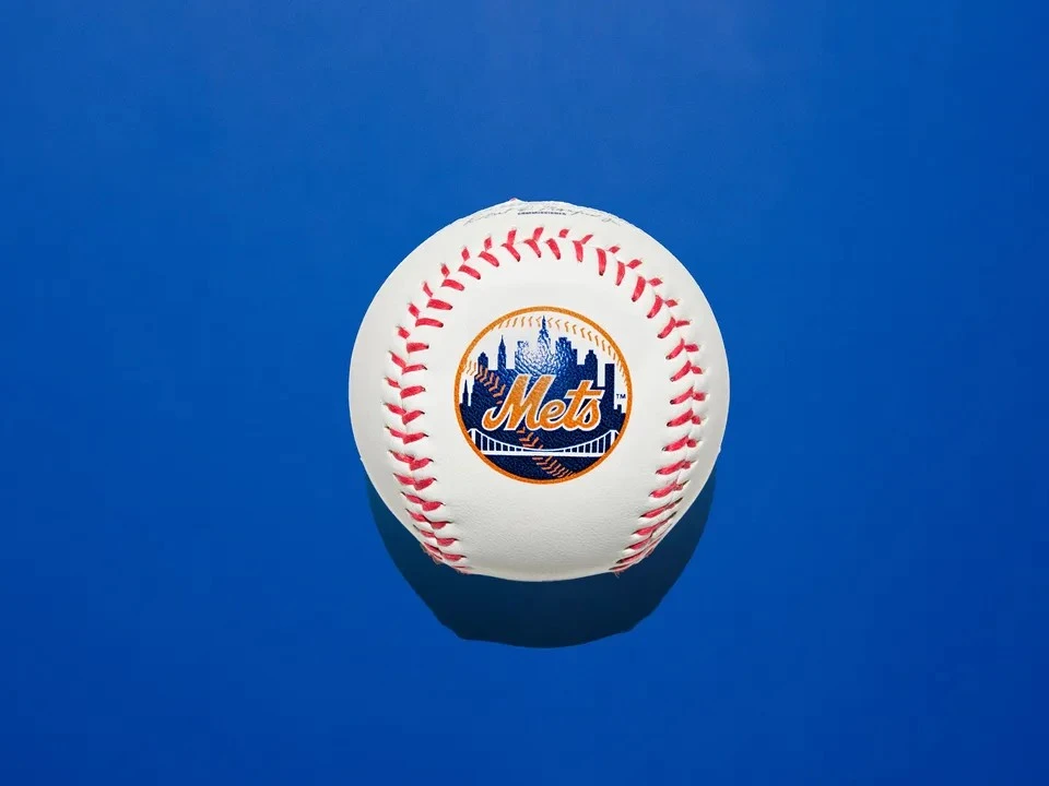
The New York Metropolitan Baseball Club was established in 1962 to soothe fans still reeling from the departure of the Brooklyn Dodgers and New York Giants. In pursuit of larger audiences and new stadiums, both beloved franchises relocated to California after the 1957 season, closing the chapter on New York’s so-called golden era of baseball.
From the outset, the Mets’ emblem (largely unchanged since its debut)was conceived as an act of reconciliation. Its dark blue field and baseball motif nod to the Brooklyn Dodgers, while the Dutch orange and interlocking 'NY' on the logo’s first version evoke the New York Giants’ branding. The result was a carefully crafted homage.